8 Built-In Objects
8.1 Overview
This section describes the built-in objects of the graphics interface. The following objects exist:
- Window
- An ordinary window.
- Button
- A simple press button.
- Checkbutton
- A button with a check-mark indicator.
- Radiobutton
- A button with an indicator that has an only-one-selected-at-a-time property.
- Label
- Shows a text or bitmap.
- Frame
- A plain container object. It is used for logical and visual grouping of objects.
- Entry
- A one-line object for entering text.
- Listbox
- A list of text strings.
- Canvas
- A drawing area which contains light-weight objects such as rectangle, line, etc.
- Menu
- A collection of objects for constructing pull-down and pop-up menus.
- Grid
- An object for showing tables. A kind of multi-column listbox.
- Editor
- A multi-line text editor.
- Scale
- To select a value within a range.
Some objects can act as container objects. The following table describes these relationships:
| Objects | Valid Parents |
| window | window, gs |
| buttons, canvas, editor, entry, frame, grid, label, listbox, menubar, scale | frame, window |
| arc, image, line, oval, polygon, rectangle, text | canvas |
| menubutton | menubar, window, frame |
| gridline | grid |
| menuitem | menu |
| menu | menubutton, menuitem (with {itemtype, cascade}), window, frame (the last two are for pop-up menus) |
8.2 Generic Options
Most objects have a common subset of options and will be referred to as generic options. They apply to most objects.
| {Option,Value} | Default | Description |
| beep | <unspec> | A beep will sound. Applies to all objects. |
| {bg, Color} | <unspec> | Background color. Applies to objects which have a background color. |
| {data, Term} | [] | Always delivered with the event in the data field. Applies to all objects. |
| {default,Objecttype,{Key,Value}} | <unspec> | Applies to all container objects. Specifies the default value for an option for children of type Objecttype. |
| {enable, Bool} | true | Objects can be enabled or disabled. A disabled object cannot be clicked on, and text cannot be entered. Applies to buttons, menuitem, entry, editor, scale. |
| {font, Font} | <unspec> | Applies to all text related objects and the grid. |
| {fg, Color} | <unspec> | Foreground color. Applies to objects which have a foreground color. |
| flush | <unspec> | Ensures that front-end and back-end are synchronized. Applies to all objects. |
| {setfocus, Bool} | <unspec> | Set or remove keyboard focus to this object. Applies to objects which can receive keyboard events. |
The following options apply to objects which can have a frame as parent. Coordinates are relative to the parent.
| {Option,Value} | Default | Description |
| {cursor, Cursor} | parent | The appearance of the mouse cursor. |
| {height, Int} | <unspec> | The height in pixels. |
| {pack_x, Column|{StartColumn,EndColumn}} | <unspec> | Packing position. See The Packer section. |
| {pack_y, row|{Startrow,Endrow}} | <unspec> | Packing position. See The Packer section. |
| {pack_xy, {Column,row}} | <unspec> | Packing position. See The Packer section. |
| {width, Int} | <unspec> | The width in pixels. |
| {x, Int} | <unspec> | The x coordinate within the parent objects frame in pixels. 0 is to the left. |
| {y, Int} | <unspec> | The y coordinate in pixels. 0 is at the top. |
| Config-Only | Description |
| lower | Lowers this object to the bottom in the visual hierarchy. |
| raise | Lowers this object in the visual hierarchy. |
The following table lists generic Read-Only options:
| Read-Only | Return | Description |
| children | [ObjectId1, ..., ObjectIdN] | All children |
| {choose_font,Font} | Font | Return the font that is actually used if a particular font is given. |
| id | ObjectId | Return the object id for this object. Useful if the object is a named object. |
| {font_wh,{Font,Text}} | {Width,Height} | Return the size of a text in a specified font. It returns the size of the font that is actually chosen by the back-end. |
| type | Atom | The type of this object. |
| parent | ObjectId | The parent of this object. |
Generic Event Options
The table below lists all generic event options:
| {Option,Value} | Default |
| {buttonpress, Bool} | false |
| {buttonrelease, Bool} | false |
| {enter, Bool} | false |
| {leave, Bool} | false |
| {keypress, Bool} | false |
| {motion, Bool} | false |
8.3 Window
The basic object is the window object. It is the most common container object. All graphical applications use at least one (top-level) window.
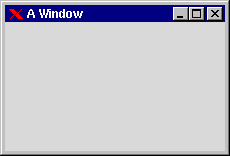
Figure 8.1: Empty Window titled "A Window".
The following tables show all window specific options:
| {Option,Value} | Default | Description |
| {bg, Color} | <unspec> | {R,G,B} or a color name |
| {configure,Bool} | false | Will generate a configureevent when the window has been resized or moved. The Argsfield contains [Width,Height,X,Y|_] |
| {destroy,Bool} | true | Will generate a destroyevent when the window is destroyed from the window manager. All GS applications should handle this event. |
| {iconname, String} | <unspec> | |
| {iconify, Bool} | false | |
| {map, Bool} | false | Make it visible on the screen |
| {title, String} | <unspec> | The title of the window. The default is the internal widget name which is platform specific. |
| Config-Only | Description |
| raise | Raise window on top of all other windows. |
| lower | Lower window to background. |
The following example shows how to create a window and configure it to enable various events.
-module(ex7).
-copyright('Copyright (c) 1991-97 Ericsson Telecom AB').
-vsn('$Revision: /main/release/2 $ ').

-export([mk_window/0]).

mk_window() ->
    S= gs:start(),
    Win= gs:create(window,S,[{motion,true},{map,true}]),
    gs:config(Win,[{configure,true},{keypress,true}]),
    gs:config(Win,[{buttonpress,true}]),
    gs:config(Win,[{buttonrelease,true}]),
    event_loop(Win).

event_loop(Win) ->
    receive
        {gs,Win,motion,Data,[X,Y | Rest]} ->
            %% mouse moved to position X Y
            io:format("mouse moved to X:~w  Y:~w~n",[X,Y]);
        {gs,Win,configure,Data,[W,H | Rest]} ->
            %% window was resized by user
            io:format("window resized W:~w  H:~w~n",[W,H]);
        {gs,Win,buttonpress,Data,[1,X,Y | Rest]} ->
            %% button 1 was pressed at location X Y
            io:format("button 1 pressed X:~w  Y:~w~n",[X,Y]);
        {gs,Win,buttonrelease,Data,[_,X,Y | Rest]} ->
            %% Any button (1-3) was released over X Y
            io:format("Any button released X:~w  Y:~w~n",[X,Y]);
        {gs,Win,keypress,Data,[a | Rest]} ->
            %% key `a' was pressed in window
            io:format("key a was pressed in window~n");
        {gs,Win,keypress,Data,[_,65,1 | Rest]} ->
            %% Key shift-a
            io:format("shift-a was pressed in window~n");
        {gs,Win,keypress,Data,[c,_,_,1 | Rest]} ->
            %% CTRL_C pressed
            io:format("CTRL_C was pressed in window~n");
        {gs,Win,keypress,Data, ['Return' | Rest]} ->
            %% Return key pressed
            io:format("Return key was pressed in window~n")
        end,
    event_loop(Win).
8.4 Button
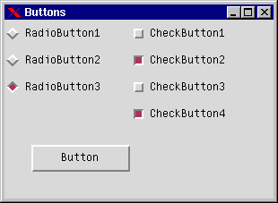
Figure 8.2: Radio Buttons, Check Buttons, and Ordinary Button
Buttons are the simplest and the most commonly used objects. You press them and get a click event. The following tables show the options for all button types.
| {Option,Value} | Default | Description |
| {align, Align} | center | Text alignment within the frame. |
| {justify, left | center | right} | center | Justification is only valid when there are several lines of text. |
| {label, Label} | <unspec> | Text or image to show. |
| {select, Bool} | false | Check buttons and radio buttons. true means that the button is selected. |
| {underline, Int} | <unspec> | Underline character N to indicate a keyboard accelerator. |
| {group, Atom} | <unspec> | Radio button: only one per group is selected at one time. Check button: All in the same group are selected automatically. |
| {value, Atom} | <unspec> | Radio buttons only. Groups radio buttons together within a group. |
| Config-Only | Description |
| flash | Flash button |
| invoke | Explicit button press. |
| toggle | Check buttons only. Toggles select value. |
| Buttontype | Event |
| normal | {gs, itemId, click, Data, [Text| _]} |
| check | {gs, itemId, click, Data, [Text, Group, Bool | _]} |
| radio | {gs, itemId, click, Data, [Text, Group, Value | _]} |
Buttons and check buttons are simple to understand, radio buttons are more difficult. Each radio button has a group and a value option. The group option is used to group together two or more radio buttons. Normally, each radio button within a group has a unique value which means that only one radio button can be selected at a time. If two (or more) radio buttons share the same value and one of them is selected, then both will be selected and all others are de-selected. The following short example shows how to program radio button logic in a situation where two of them share the same value.
-module(ex8).
-copyright('Copyright (c) 1991-97 Ericsson Telecom AB').
-vsn('$Revision: /main/release/2 $ ').

-export([start/0]).

start() ->
    gs:window(win,gs:start(),{map,true}),
    gs:radiobutton(rb1,win,[{label,{text,"rb1"}},{value,a},{y,0}]),
    gs:radiobutton(rb2,win,[{label,{text,"rb2"}},{value,a},{y,30}]),
    gs:radiobutton(rb3,win,[{label,{text,"rb3"}},{value,b},{y,60}]),
    rb_loop().

rb_loop() ->
    receive
        {gs,Any_Rb,click,Data,[Text, Grp, a | Rest]} ->
            io:format("either rb1 or rb2 is on.~n",[]),
            rb_loop();
        {gs,rb3,click,Data,[Text, Grp, b | Rest]} ->
            io:format("rb3 is selected.~n",[]),
            rb_loop()
    end.
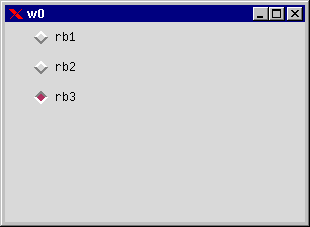
Figure 8.3: Radio Button Group with Last Button Selected
The example shown creates three radio buttons which are members of the same group. The default behavior is that all radio buttons created by the same process are members of the same group. Normally, only one in a group may be selected at the same time, but since we defined the value-option to have the same value for rb1 and rb2, they will both be selected/de-selected simultaneously. The normal radio button group behavior is that all radio buttons within the same group have unique default values.
8.5 Label
| {Option,Value} | Default | Description |
| {align,Align} | center | How the text is aligned within the frame. |
| {justify,left|right|center} | left | How to justify several lines of text. |
| {label,Label} | <unspec> | Text or image to show. |
| {underline,Int} | <unspec> | Underline character N to indicate a keyboard accelerator. |
A label is a simple text field which is used to display text to the user. It is possible to have several lines of text by inserting newline '\ ' characters between each line. The label object does not automatically adjust its size so that text will fit inside. This has to be done manually, or the text may be clipped at the edges.
8.6 Frame
The frame object acts as a container for other objects. Its main use is to logically and visually group objects together. Grouped objects can then be moved, displayed, or hidden in one single operation.
| {Option,Value} | Default | Description |
| {bw,Int} | <unspec> | Border width |
| {packer_x,PackList} | <unspec> | Makes the frame pack its children. See the packer section. |
| {packer_y,PackList} | <unspec> | Makes the frame pack its children. See the packer section. |
It is possible to have frame objects within frame objects so that large hierarchical structures of objects can be created.
8.7 Entry
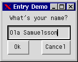
Figure 8.4: Label and Entry Objects for User Input
| {Option,Value} | Default | Description |
| {justify, left|right|center} | left | Text justification in entry field. |
| {text, String} | <unspec> | Use this option to initially set some text, and to read the text. |
Entrys are used to prompt the user for text input.
| Config-Only | Description |
| {delete, {From, To}} | Deletes the characters within index {From,To}. |
| {delete, last} | Deletes the last character. |
| {delete, Index} | Deletes the character at position Index. |
| {insert, {Index, String}} | Inserts text at the specific character position. Index starts from 0. |
| {select, {From, To}} | Selects a range. |
| {select, clear} | De-selects selected text. |
A common usage of the entry object is to listen for the 'Return' key event and then read the text field. The following example shows a simple dialog which prompts the user for a name and returns the tuple {name,Name} when a name is entered, or cancel if the cancel button is pressed.
-module(ex9).
-copyright('Copyright (c) 1991-97 Ericsson Telecom AB').
-vsn('$Revision: /main/release/2 $ ').

-export([start/0,init/1]).

start() ->
    spawn(ex9, init, [self()]),
    receive
        {entry_reply, Reply} -> Reply
    end.

init(Pid) ->
    S = gs:start(),
    Win = gs:create(window,S,[{title,"Entry Demo"},
                              {width,150},{height,100}]),
    gs:create(label,Win,[{label,{text,"What's your name?"}},
                         {width,150}]),
    gs:create(entry,entry,Win,[{x,10},{y,30},{width,130},
                               {keypress,true}]),
    gs:create(button,ok,Win,[{width,45},{y,60},{x,10},
                             {label,{text,"Ok"}}]),
    gs:create(button,cancel,Win,[{width,60},{y,60},{x,80},
                                 {label,{text,"Cancel"}}]),
    gs:config(Win,{map,true}),
    loop(Pid).

loop(Pid) ->
    receive
        {gs,entry,keypress,_,['Return'|_]} ->
            Text=gs:read(entry,text),
            Pid ! {entry_reply,{name,Text}};
        {gs,entry,keypress,_,_} -> % all other keypresses
            loop(Pid);
        {gs,ok,click,_,_} ->
            Text=gs:read(entry,text),
            Pid ! {entry_reply,{name,Text}};
        {gs,cancel,click,_,_} ->
            Pid ! {entry_reply,cancel};
        X ->
            io:format("Got X=~w~n",[X]),
            loop(Pid)
    end.
The program draws the dialog and waits for the user to either press the return key or click one of the buttons. It then reads the text option of the entry and returns the string to the client process.
8.8 Listbox
A listbox is a list of labels with optional scroll bars attached. The user selects one or more predefined alternative entries. You can add and remove entries in the listbox. The first element in a listbox has index 0.
| {Option,Value} | Default | Description |
| {hscroll, Bool | top | bottom} | true | Horizontal scroll bar. |
| {items, [String, String ... String]} | <unspec> | All items (entries) in the listbox. |
| {scrollbg, Color} | <unspec> | Foreground color of scroll bar. |
| {scrollfg, Color} | <unspec> | Background color of scroll bar. |
| {selectmode, single | multiple} | single | Controls if it is possible to have several items selected at the same time. |
| {vscroll, Bool | left | right} | true | Vertical scroll bar. |
| Config-Only | Description |
| {add, {Index, String}} | Add an item at specified index. |
| {add, String} | Add an item last. |
| {change, {Index,String}} | Change one item. |
| clear | Delete all items. |
| {del, Index | {From, To}} | Delete an item at specified index, or all from index From to index To. |
| {see, Index} | Make the item at specified index visible. |
| {selection, Index | {From,To}| clear} | Select an item (highlight it). Clear erases the selection. |
| Read-Only | Return | Description |
| selection | ListOfStrings | Returns current selection. All selected item indices will be returned in a list. |
| size | Int | The number of items (entries) in the listbox. |
| {get, Index} | String | Returns item at specified index. |
| Event |
| {gs, ListBox, click, Data, [Index, Text,Bool | _]} |
| {gs, ListBox, doubleclick, Data, [Index, Text,Bool | _]} |
Bool is true if object is selected, false if de-selected.
Note that click and doubleclick are two discrete events: if you have subscribed to both, you will receive both a click event and a doubleclick event when double-clicking on one item (since two rapid clickings are regarded as both a click and a doubleclick). The subscription of doubleclick events does not result in the click events being unsubscribed!
The following example shows a simple application which prompts the user for a text item. The user has the following options:
- browse the items and then double-click the required item
- type the name into the entry field and then press the Return key
- select the required item and then click the OK button.
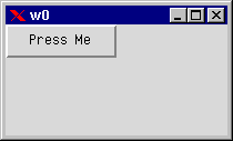
Figure 8.5: Simple Browser Dialog
-module(ex10).
-copyright('Copyright (c) 1991-97 Ericsson Telecom AB').
-vsn('$Revision: /main/release/2 $ ').

-export([start/0, init/3]).

start() ->
    start("Pick a fruit:",
          [apple, banana, lemon, orange, strawberry,
           mango, kiwi, pear, cherry,pineapple,peach,apricot]).

start(Text,Items) ->
    spawn(ex10,init,[self(),Text,Items]),
    receive
        {browser,Result} -> Result
    end.

init(Pid,Text,Items) ->
    S=gs:start(),
    Win=gs:window(S,[{width,250},{height,270},
                     {title,"Browser"}]),
    Lbl=gs:label(Win,[{label,{text,Text}},{width,250}]),
    Entry=gs:entry(Win,[{y,35},{width,240},{x,5},
                        {keypress,true},
                        {setfocus,true}]),
    Lb=gs:listbox(Win,[{x,5},{y,65},{width,160},
                       {height,195},{vscroll,right},
                       {click,true},{doubleclick,true}]),
    Ok=gs:button(Win,[{label,{text,"OK"}},
                      {width,40},{x,185},{y,175}]),
    Cancel=gs:button(Win,[{label,{text,"Cancel"}},
                          {x,175},{y,225},{width,65}]),
    gs:config(Lb,[{items,Items}]),
    gs:config(Win,{map,true}),
    browser_loop(Pid,Ok,Cancel,Entry,Lb).

browser_loop(Pid,Ok,Cancel,Entry,Lb) ->
    receive
        {gs,Ok,click,_,_} ->
            Txt=gs:read(Entry,text),
            Pid ! {browser,{ok,Txt}};
        {gs,Cancel,click,_,_} ->
            Pid ! {browser,cancel};
        {gs,Entry,keypress,_,['Return'|_]} ->
            Txt=gs:read(Entry,text),
            Pid ! {browser,{ok,Txt}};
        {gs,Entry,keypress,_,_} ->
            browser_loop(Pid,Ok,Cancel,Entry,Lb);
        {gs,Lb,click,_,[Idx, Txt|_]} ->
            gs:config(Entry,{text,Txt}),
            browser_loop(Pid,Ok,Cancel,Entry,Lb);
        {gs,Lb,doubleclick,_,[Idx, Txt|_]} ->
            Pid ! {browser,{ok,Txt}};
        {gs,_,destroy,_,_} ->
            Pid ! {browser,cancel};
        X ->
            io:format("Got X=~w~n",[X]),
            browser_loop(Pid,Ok,Cancel,Entry,Lb)
    end.
8.9 Canvas
The canvas object is a simple drawing area. The user can draw graphical objects and move them around the drawing area. The canvas also has optional scroll bars which can be used to scroll the drawing area. The graphical objects that can be created on a canvas object are:
- arc
- image
- line
- oval
- polygon
- rectangle
- text.
These objects must have a canvas object as a parent, but they are otherwise similar to all other basic objects. The following tables show the options which apply to canvas objects.
| {Option,Value} | Default | Description |
| {bg, Color} | <unspec> | Color of the drawing area. |
| {hscroll, Bool | top | bottom} | false | Horizontal scroll bar. |
| {scrollbg, Color} | <unspec> | Foreground color of scroll bar. |
| {scrollfg, Color} | <unspec> | Background color of scroll bar. |
| {scrollregion, {X1,Y1,X2,Y2}} | <unspec> | The size of the drawing area to be scrolled. |
| {vscroll, Bool | left | right} | false | Vertical scroll bar. |
| Read-Only | Return | Description |
| {hit, {X,Y}} | list of ObjectId | Returns the canvas objects at X,Y. |
| {hit, [{X1,Y1},{X2,Y2}]} | list of ObjectId | Returns the canvas objects which are hit by the rectangle. |
Canvas objects have the same types of events as other objects. The following Config-Only options also apply to canvas objects:
| Config-Only | Description |
| lower | Lowers the object. |
| {move, {Dx, Dy}} | Moves object relative to its current position. |
| raise | Raises the object above all other objects. |
The following sections describe the graphical objects which can be drawn on a canvas object.
The Canvas Arc Object
The canvas arc object is defined within a rectangle and is drawn from a start angle to the extent angle. Origo is in the center of the rectangle.
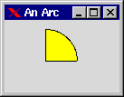
Figure 8.6: Canvas Arc Object
gs:create(arc,Canvas,[{coords,[{10,10},{80,80}]},{fill,yellow}]).
| {Option,Value} | Default | Description |
| {bw, Int} | 1 | Defines the width. |
| {coords, [{X1,Y1},{X2,Y2}]} | Defines a rectangle to draw the arc within. | |
| {extent, Degrees} | ||
| {fg, Color} | ||
| {fill, Color|none} | none | Defines fill color of arc object. |
| {start, Degrees} | ||
| {style, arc} | No line segments. | |
| {style, chord} | A single line segment connects the two end points of the perimeter section. | |
| {style, pieslice} | This Style | Two lines are drawn between the center of the oval and each end of the perimeter section. |
The Canvas Image Object
The canvas image object displays images and moves them around in a simple way. The currently supported image formats are bitmap and gif.
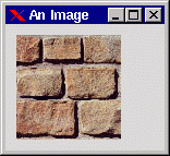
Figure 8.7: Canvas Image Object
gs:create(image,Canvas,[{load_gif,"brick.gif"}]).
| {Option,Value} | Default | Description |
| {anchor, Anchor} | nw | Anchor reference specified by {X,Y} . |
| {bg, Color} | <unspec> | Background color. Pixel value 0. |
| {bitmap, FileName} | <unspec> | A bitmap file which contains a bmp bitmap. |
| {coords, [{X,Y}]} | <unspec> | Position on the canvas. |
| {fg, Color} | <unspec> | Foreground color. Pixel value 1. |
| {load_gif, FileName} | <unspec> | Loads a gif image. |
The Canvas Line Object
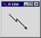
Figure 8.8: Line Object Drawn on a Canvas
gs:create(line,Canvas,
          [{coords,[{25,25},{50,50},{50,40},{85,75}]},
           {arrow,last},{width,2}]).
| {Option,Value} | Default | Description |
| {arrow, both | none | first | last} | none | Draws arrows at the end points of the line. |
| {coords, [{X1,Y1},{X2,Y2}, ... {Xn,Yn}]} | <unspec> | A list of coordinates. The line will be drawn between all pairs in the list. |
| {fg, Color} | <unspec> | The color of the line. |
| {smooth, Bool} | false | Smoothing with Bezier splines. |
| {splinesteps, Int} | <unspec> | |
| {width, Int} | 1 | The width of the line. |
The Canvas Oval Object
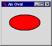
Figure 8.9: Oval Object Drawn on a Canvas
gs:create(oval,Canvas,
          [{coords,[{25,25},{125,75}]},{fill,red},{bw,2}]).
| {Option,Value} | Default | Description |
| {bw, Int} | 1 | Width. |
| {coords, [{X1,Y1},{X2,Y2}]} | <unspec> | Bounding rectangle which defines shape of object. |
| {fg, Color} | ||
| {fill, Color|none} | none | Object fill color. |
The Canvas Polygon Object
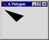
Figure 8.10: Canvas Polygon Object
gs:create(polygon,Canvas,
          [{coords,[{10,10},{50,50},{75,30}]}]).
| {Option,Value} | Default | Description |
| {bw, Int} | 1 | Width. |
| {coords, [{X1,Y1},{X2,Y2} | {Xn,Yn}]} | <unspec> | Defines all points in the polygon. There may be any number of points in the polygon. |
| {fg, Color} | black | The color of the polygon outline. |
| {fill, Color|none} | none | |
| {smooth, Bool} | false | Smoothing with Bezier splines. |
| {splinesteps, Int} | <unspec> |
The Canvas Rectangle Object
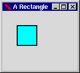
Figure 8.11: Rectangle Object Created on a Canvas
gs:create(rectangle,Canvas,
          [{coords,[{30,30},{70,70}]},{fill,cyan},{bw,2}]).
| {Option,Value} | Default | Description |
| {bw, Int} | 1 | The width of the border line. |
| {coords, [{X1,Y1},{X2,Y2}]} | <unspec> | Defines rectangle coordinates. |
| {fg, Color} | <unspec> | The color of the border line. |
| {fill, Color|none} | none | Fill color of rectangle. |
The Canvas Text Object
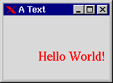
Figure 8.12: Canvas Text Object
gs:create(text,C,[{coords,[{50,50}]},
                  {font,{times,18}},
                  {fg,red},
                  {text,"Hello World!"}]).
| {Option,Value} | Default | Description |
| {anchor, Anchor} | nw | Anchor reference specified by {X,Y}. |
| {coords, [{X, Y}]} | <unspec> | Position in the canvas. |
| {fg, Color} | <unspec> | Text color (background color is the canvas color). |
| {justify, left | center | right} | <unspec> | Tex justification. Only valid with several lines of text. |
| {text, String} | <unspec> | The text string to display. |
| {width, Int} | The width in pixels. The text will be wrapped into several lines to fit inside the width. |
8.10 Menu
Menus consist of four object types:
- the menu bar
- the menu button
- the menu
- the menu item.
Menu Bar
The menu bar is a simple object. It is placed at the top of the window and contains menu items. {x,y} or width cannot be controlled since, by definition, the menu bar is placed at the top of the window.
| {Option,Value} | Default | Description |
| <only generic options> |
Menu Button
The menu button displays a menu when pressed. The width of the menu button is automatically determined by the size of the text.
| {Option,Value} | Default | Description |
| {align, Align} | center | Text alignment within the frame. |
| {justify, left | center | right} | center | Justification is only valid when there are several lines of text. |
| {label,{text,Text}} | <unspec> | |
| {side, left | right} | <unspec> | Placement on the menu bar. The menu button created first will have the left/right position. |
| {underline, Int} | <unspec> | Underline character N to indicate an keyboard accelerator. |
Menu
The menu contains menu items, which are displayed vertically. Its width is automatically determined by the width of the menu items it contains.
| {Option,Value} | Default | Description |
| {selectcolor, Color} | <unspec> | The indicator color of radio buttons and check buttons. |
| Config-Only | Description |
| {post_at,{X,Y}} | Displays the menu as a pop-up menu at {X,Y} (coordinate system of the parent). |
Menu Item
The menu item is an object of its own. It can send events when the user selects it.
| {Option,Value} | Default | Description |
| {group, Atom} | <unspec> | For {type, radio|check}. |
| {itemtype, type} | normal | The type of this item. Cannot be reconfigured. |
| {label, {text,Text}} | <unspec> | The text of the item. |
| {underline, Int} | <unspec> | Underline character N to indicate an keyboard accelerator. |
| {value, Atom} | <unspec> |
type: normal | separator | check | radio | cascade
| itemtype | Event |
| normal | {gs, itemId, click, Data, [Text, Index | _]} |
| check | {gs, itemId, click, Data, [Text, Index, Group, Bool| _]} |
| radio | {gs, itemId, click, Data, [Text, Index, Group, Value| _]} |
| Read-Only | Return | Description |
| index | Int | Index in the menu. Starts counting from 0. |
Menu Demo
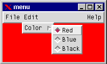
Figure 8.13: Simple Menu
The following example shows a short demo of the gs menus:
-module(ex13).
-copyright('Copyright (c) 1991-97 Ericsson Telecom AB').
-vsn('$Revision: /main/release/2 $ ').

-export([start/0,init/0]).

start() -> spawn(ex13, init, []).

init() ->
    I=gs:start(),
    Win=gs:window(I, [{width,200},{height,100},
                      {title,"menu"},{map, true}]),
    Bar = gs:create(menubar, Win, []),
    Fmb = gs:create(menubutton, Bar,
                    [{label,{text,"File"}}]),
    Emb = gs:create(menubutton, Bar,
                    [{label,{text,"Edit"}}]),
    Hmb = gs:create(menubutton, Bar,
                    [{label,{text,"Help"}},{side,right}]),
    Fmnu = gs:create(menu, Fmb, []),
    Emnu = gs:create(menu, Emb, []),
    Hmnu = gs:create(menu, Hmb, []),
    gs:create(menuitem, load, Fmnu,
              [{label,{text, "Load"}}]),
    gs:create(menuitem, save, Fmnu,
              [{label,{text, "Save"}}]),
    Exit = gs:create(menuitem, Fmnu,
                     [{label,{text, "Exit"}}]),
    Color = gs:create(menuitem, Emnu,
                      [{label,{text, "Color"}},
                       {itemtype, cascade}]),
    Cmnu = gs:create(menu, Color, [{disabledfg,gray}]),
    gs:create(menuitem, Cmnu, [{label, {text,"Red"}},
                               {data, {new_color, red}},
                               {itemtype,radio},{group,gr1}]),
    gs:create(menuitem, Cmnu, [{label, {text,"Blue"}},
                               {data, {new_color, blue}},
                               {itemtype,radio},{group,gr1}]),
    gs:create(menuitem,Cmnu, [{label, {text,"Black"}},
                              {data, {new_color, black}},
                              {itemtype,radio},{group,gr1}]),
    Y = gs:create(menuitem, Hmnu, [{label, {text,"You"}},
                                   {itemtype, check}]),
    M = gs:create(menuitem, me, Hmnu, [{label, {text, "Me"}},
                                       {itemtype, check}]),
    gs:create(menuitem, Hmnu, [{itemtype, separator}]),
    gs:create(menuitem, Hmnu, [{label, {text, "Other"}},
                               {itemtype, check},
                               {enable,false}]),
    gs:create(menuitem, doit, Hmnu, [{label, {text, "Doit!"}},
                                     {data, {doit, Y, M}}]),
    loop(Exit, Win).

loop(Exit, Win) ->
    receive
        {gs, save, click, _Data, [Txt, Index | Rest]} ->
            io:format("Save~n");
        {gs, load, click, _Data, [Txt, Index | Rest]} ->
            io:format("Load~n");
        {gs, Exit, click, _Data, [Txt, Index | Rest]} ->
            io:format("Exit~n"),
            exit(normal);
        {gs, _MnuItem, click, {new_color, Color}, Args} ->
            io:format("Change color to ~w. Args:~p~n",
                      [Color, Args]),
            gs:config(Win, [{bg, Color}]);
        {gs, doit, click, {doit, YouId, MeId}, Args} ->
            HelpMe = gs:read(MeId, select),
            HelpYou = gs:read(YouId, select),
            io:format("Doit. HelpMe:~w, HelpYou:~w, Args:~p~n",
                      [HelpMe, HelpYou, Args]);
        Other -> io:format("Other:~p~n",[Other])
    end,
    loop(Exit, Win).
8.11 Grid
The grid object is similar to the listbox object. The main difference is that the grid is a multi-column object which is used to display tables. If needed, the grid can send click events when a user presses the mouse button in a table cell. Although the grid has a behavior which is similar to the listbox, the programming is somewhat different. The data in a table cell is represented as a pure gs object and can be treated as such. This object is called a grid line. It is located at a row in the parent grid. If a grid line is clicked, it sends an event to its owner.
Grid Line
| {Option,Value} | Default | Description |
| {{bg, Column},Color} | <unspec> | The background color of a cell. |
| {bg, {Column,Color}} | <unspec> | Equivalent to {{bg, Column},Color}. |
| {bg, Color} | <unspec> | The background color of all cells. |
| {click, Bool} | true | Turns click events on/off. |
| {doubleclick, Bool} | false | Turns double-click events on/off. |
| {{fg, Column},Color} | <unspec> | The foreground color of a cell. |
| {fg, {Column,Color}} | <unspec> | Equivalent to {{fg, Column},Color} |
| {fg,Color} | <unspec> | The foreground color of all cells. |
| {text, {Column,Text}} | <unspec> | The text in the cell. |
| {{text, Column},Text} | <unspec> | Equivalent to {text,{Column,Text}}. |
| {text,Text} | <unspec> | The text for all cells. |
| {row, {row}} | <unspec> | The grid row. Must not be occupied by another grid line. |
| Event |
| {gs, GridLineId, click, Data, [Col, row, Text | _]} |
| {gs, GridLineId, doubleclick, Data, [Col, row, Text | _]} |
Grid
| {Option,Value} | Default | Description |
| {font,Font} | <unspec> | A "global" grid font. |
| {hscroll, Bool|top|bottom} | true | Horizontal scroll bar. |
| {vscoll, Bool|left|right} | true | Vertical scroll bar. |
| {rows, {Minrow,Maxrow}} | <unspec> | The rows which are currently displayed. |
| {columnwidths, [WidthCol1,WidthCol2, ..., WidthColN}} | <unspec> | Defines the number of columns and their widths in coordinates. The size of the columns can be reconfigured, but not the number of columns. |
| {fg, Color} | <unspec> | The color of the grid pattern and the text. |
| {bg, Color} | <unspec> | The background color. |
| Read-Only | Return | Description |
| {obj_at_row, row} | Object |undefined | The grid line at row. |
The rows and columns start counting at 1.
Grid Demo
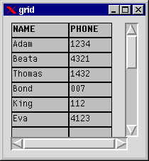
Figure 8.14: Simple Grid
The following simple example shows how to use the grid.
-module(ex12).
-copyright('Copyright (c) 1991-97 Ericsson Telecom AB').
-vsn('$Revision: /main/release/2 $ ').

-export([start/0,init/0]).

start() -> spawn(ex12, init, []).

init() ->
    R=[{window,[{width,200},{height,200},{title,"grid"},{map, true}],
	{grid, [{x,10},{y,10},{height,180},{width,180},{columnwidths,[80,60]},
		{rows,{1, 20}}],
	 [{gridline,[{text,{1,"NAME"}},{text,{2,"PHONE"}},
		    {font,{screen,bold,12}},{row,1},{click,false}]},
	  {gridline,[{text,{1,"Adam"}},{text,{2,"1234"}},{row,2}]},
	  {gridline,[{text,{1,"Beata"}},{text,{2,"4321"}},{row,3}]},
	  {gridline,[{text,{1,"Thomas"}},{text,{2,"1432"}},{row,4}]},
	  {gridline,[{text,{1,"Bond"}},{text,{2,"007"}},{row,5}]},
	  {gridline,[{text,{1,"King"}},{text,{2,"112"}},{row,6}]},
	  {gridline,[{text,{1,"Eva"}},{text,{2,"4123"}},{row,7}]}]}}],
    gs:create_tree(gs:start(),R),
    loop().

loop() ->
    receive
	{gs,_Win,destroy,_Data,_Args} -> bye;
	{gs,_Gridline,click,_Data,[Col,Row,Text|_]} ->
	    io:format("Click at col:~p row:~p text:~p~n",[Col,Row,Text]),
	    loop();
        Msg ->
            io:format("Got ~p~n",[Msg]),
	    loop()
    end.
8.12 Editor
The editor object is a simple text editor.
| {Option,Value} | Default | Description |
| {hscroll, Bool | top | bottom} | false | Horizontal scroll bar. |
| {insertpos,{row,Col}} | <unspec> | The position of the cursor. |
| {insertpos,'end'} | <unspec> | The position of the cursor. |
| {justify, left| right| center} | left | Text justification. |
| {scrollbg, Color} | <unspec> | Background color of scroll bar. |
| {scrollfg, Color} | <unspec> | Foreground color of scroll bar. |
| {selection, {FromIndex,ToIndex}} | <unspec> | The text range that is currently selected. |
| {vscroll, Bool | left | right} | false | Vertical scroll bar. |
| {vscrollpos, row} | <unspec> | The top most visible row in the editor. |
| {wrap, none|char | word} | none | How to wrap text when the line is full. |
| Config-Only | Description |
| clear | Clears the editor. |
| {del, {FromIndex, ToIndex}}} | Deletes text. |
| {fg, {{FromIndex,ToIndex},Color}} | Sets the foreground color of a range of text. |
| {load, FileName} | Read FileName into the editor. |
| {insert, {Index, Text}} | Inserts new text. |
| {overwrite, {Index, Text}} | Writes new text at index. |
| {save, FileName} | Writes editor contents to file. |
| Read-Only | Return | Description |
| char_height | Int | The height of the editor window measured in characters. |
| char_width | Int | The width of the editor window measured in characters. |
| {fg,Index} | Int | The foreground color of the text at Index. |
| {get,{FromIndex, ToIndex}} | Text | The text between the indices. |
| size | Int | The number of rows in the editor. |
Index: 'end'|insert|{row,Col}|{row,lineend}
Editor Demo
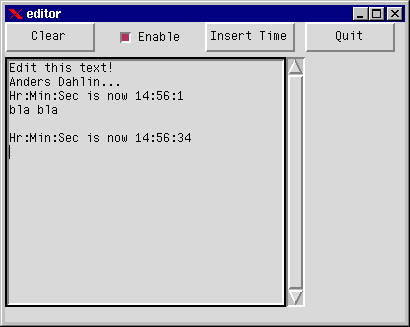
Figure 8.15: Simple Editor
-module(ex14).
-copyright('Copyright (c) 1991-97 Ericsson Telecom AB').
-vsn('$Revision: /main/release/2 $ ').

-export([start/0,init/0]).

start() -> spawn(ex14, init, []).

init() ->
    Y = [{y,0},{height, 30},{width, 90}],
    R=[{window, [{width, 400},{height, 300}, {title,"editor"},{map, true}],
       [{editor,editor,[{x,0},{y, 35},{width,300},{height,250},
			{insert,{'end',"Edit this text!"}},{vscroll,right}]},
	{button, clear, [{label, {text, "Clear"}},{x,0} | Y]},
	{checkbutton,enable,[{label,{text,"Enable"}},{select,false},{x,100}|Y]},
	{button, time, [{label, {text, "Insert Time"}},{x,200} | Y]},
	{button, quit,  [{label, {text, "Quit"}},{x,300} | Y]}]}],
    gs:create_tree(gs:start(),R),
    gs:config(editor,{enable,false}),
    loop().

loop() ->
    receive
        {gs, clear, _, _, _} ->
            io:format("clear editor~n"),
            Enable = gs:read(editor, enable),
            gs:config(editor,{enable, true}),
            gs:config(editor,clear),
            gs:config(editor,{enable, Enable});
        {gs, enable, _, _, [_Txt, _Grp, Enable|_]} ->
            io:format("Enable: ~w~n", [Enable]),
            gs:config(editor,{enable, Enable});
        {gs, time, _, _, _} ->
            TimeStr = io_lib:format("Hr:Min:Sec is now ~w:~w:~w~n",
                                    tuple_to_list(time())),
            io:format("Insert Time: ~s~n", [TimeStr]),
            Enable = gs:read(editor, enable),
            gs:config(editor,{enable, true}),
            gs:config(editor,{insert, {insert, TimeStr}}),
            gs:config(editor,{enable, Enable});
        {gs, quit, _, _, _} ->
            exit(normal);
        Other ->
            io:format("Other:~w~n",[Other])
    end,
    loop().
8.13 Scale
A scale object is used to select a value within a specified range.
| {Option,Value} | Default | Description |
| {orient, vertical | horizontal} | horizontal | The orientation of the scale. |
| {pos, Int} | <unspec> | The current value of the scale objects within the range. |
| {range, {Min, Max}} | <unspec> | The value range. |
| {showvalue, Bool} | true | Turns showing of scale value on/off. |
| {text, String} | <unspec> | If specified, a label will be attached to the scale. |
| Event |
| {gs, Scale, click, Data, [Value | _]} |
The following example prompts a user to specify an RGB-value for the background color of a window.
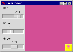
Figure 8.16: Scale Objects for Selecting RGB Values for a Window
-module(ex11).
-copyright('Copyright (c) 1991-97 Ericsson Telecom AB').
-vsn('$Revision: /main/release/3 $ ').

-export([start/0,init/0]).

start() ->
    spawn(ex11,init,[]).

init() ->
    I= gs:start(),
    W= gs:window(I,[{title,"Color Demo"},
                    {width,300},{height,195}]),
    B=gs:button(W,[{label,{image,"die_icon"}},{x,271},{y,166},
                   {width,30}]),
    gs:config(B,[{bg,yellow},{fg,hotpink1},{data,quit}]),
    gs:scale(W,[{text,"Red"},{y,0},{range,{0,255}},
                {orient,horizontal},
                {height,65},{data,red},{pos,42}]),
    gs:scale(W,[{text,"Blue"},{y,65},{range,{0,255}},
                {orient,horizontal},
                {height,65},{data,blue},{pos,42}]),
    gs:scale(W,[{text,"Green"},{y,130},{range,{0,255}},
                {orient,horizontal},
                {height,65},{data,green},{pos,42}]),
    gs:config(W,{map,true}),
    loop(W,0,0,0).

loop(W,R,G,B) ->
    gs:config(W,{bg,{R,G,B}}),
    receive
        {gs,_,click,red,[New_R|_]} ->
            loop(W,New_R,G,B);
        {gs,_,click,green,[New_G|_]} ->
            loop(W,R,New_G,B);
        {gs,_,click,blue,[New_B|_]} ->
            loop(W,R,G,New_B);
        {gs,_,click,quit,_} ->
            true;
        {gs,W,destroy,_,_} ->
            true
    end.
